Summaries like this, in your inbox every morning.
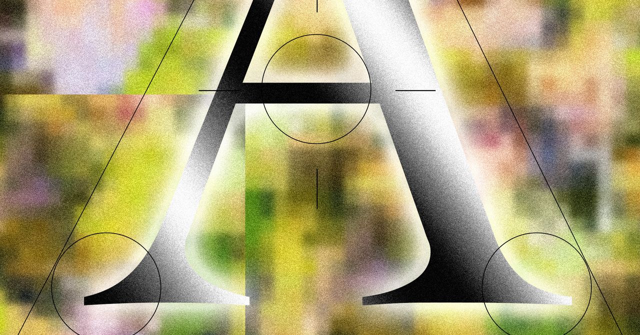
Sign up free →AI companies including Anthropic's Claude, Runway, Perplexity, and Manus have adopted serif typefaces in their user experience and branding, a shift designer Keya Vadgama has termed 'the serif renaissance.'
Serif fonts carry connotations of scholarship, authority, and print media (historically used in books, newspapers, and the Encyclopedia Britannica), whereas sans serif fonts are perceived as sterile and computer-like. Claude also uses a slightly brown background to mirror a book page and emulate the feeling of reading print.
The shift reflects a response to public skepticism of AI: typeface choices signal trust at a psychological level and attempt to counter AI's perceived lack of soul, though critic Keya Vadgama notes using serifs to suggest 'We're not one of those scary AI companies' remains 'a little dishonest' when companies are still AI companies.
AI-summarized, only the topics you pick — one digest a day via Email, Slack, or Discord.
Free · takes 30 seconds · unsubscribe anytime
No discussion yet for this article
Get curated AI news from 200+ sources delivered daily to your inbox. Free to use.
Get Started FreeFree · takes 30 seconds · unsubscribe anytime
1 minute a day. The AI essentials.
200+ sources · Email / LINE / Slack